Pareto Histogram
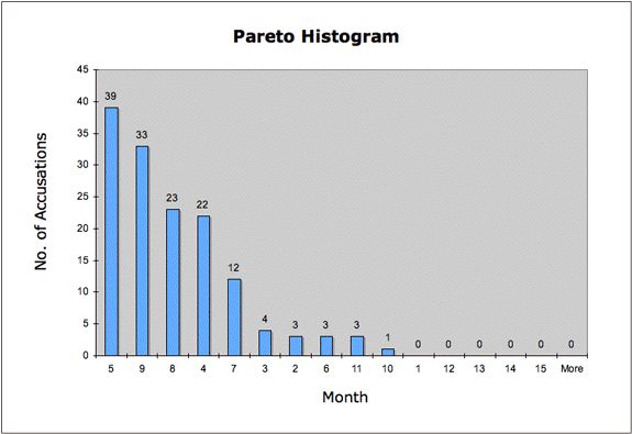
A Pareto histogram is a bar graph that sorts cases in descending order; for the Salem data, it presents the months in which particularly large and small numbers of cases occurred.
To construct a Pareto histogram, modifications should be made to the Accused Histogram Data Set to eliminate unknown cases (-1); only cases in which the months of accusation are known can provide an accurate count of cumulated cases. In Excel, select the "Month of Accusation" column, go to the Data Menu and select "Filter" and then "AutoFilter." Click the resulting AutoFilter button in the column heading and choose "Sort Ascending." Proceed to the Tools Menu to select "Data Analysis" and "Histogram." For the "Input range," select the cells in the "Month of Accusation column beginning with "2." For the "Bin range," exclude "-1" and select from the "Bin" column only case beginning with "1." Do not select "Labels." Select "New worksheet ply," "Pareto (sorted histogram)" and "Chart output.
The Pareto chart of Salem accusations highlights the months of May and September as the peak months of each of two waves of accusations. It also points to the outbreak's slow beginning in February and March, when few accusations were made, as well as the sharp decline of accusations in both June and October.
To return to the Accusation Discussion screen, click Back or Next.